What we do
Marketing & Communication's role is to provide on-brand, effective marketing and communication solutions that ensure the institution speaks with "one voice" to strengthen our brand and reach. We will work collaboratively with your organization or department to determine the best solutions to meet your needs as part of the institution's communication strategy.
The office is responsible for the central communication functions of Marietta College, including:
- media and public information;
- marketing;
- public relations;
- digital strategy;
- social media strategy;
- integrated communications;
- design and branding; and
- strategic marketing/community partnerships.
We are the public voice of the College for multiple audiences, both internal and external. Working across the College and partnering with multiple departments, we take an integrated approach to increasing visibility, building reputation and keeping our audiences informed. To achieve a cohesive strategic communications approach that is coherent, collaborative and accountable, we help to establish Marietta’s media communication and public information priorities, along with communication processes and procedures.
We are a resource for communications counsel and provide high-quality, professional communications services that include editorial support, graphic design, photography, video and online communications, including the College's website.
The Marketing & Communication team is a group of award-winning, highly skilled marketing and communication professionals. We’re here to put Marietta College’s story in print, on magazine covers, on air, on social media, and in videos and photos—we strive to tell the Marietta story anywhere we can find an audience.
Let's Work Together!
Use our easy 1-stop form to initiate a request for services
The entire team is focused on contributing to the best outcome for your project and all team members share the information submitted using the form - please do not directly email requests to individuals. Not sure what you need? Submit the form to request a Marketing & Communication consultation and we'll reach out to schedule a time to help you solve your marketing and communication goals.
USE THE REQUEST FORM FOR THESE SERVICES:
- News/Announcements (including NEWS Made @ Marietta items)
- Events Calendar Submissions
- Design/Print Projects
- Campus Monitors / Screens Messaging
- Photo or Video Projects
- Social Media Projects (news/announcements/calendar submissions are shared with social media--a second request is not needed)
- Website update or Page Creation Request
- Branded Items: t-shirts, giveaways, tabletop displays, etc.
- Marketing/Communication Consultation (for project or brand guidance)
If the request is for multiple services for the same project--for example, design/print, website, and social media for one event--select Marketing & Communication Consultation, provide a brief description, and we will contact you for details.
Help tell the story of your department or program by providing information using the attached Word document form.
Department / Program Information Form
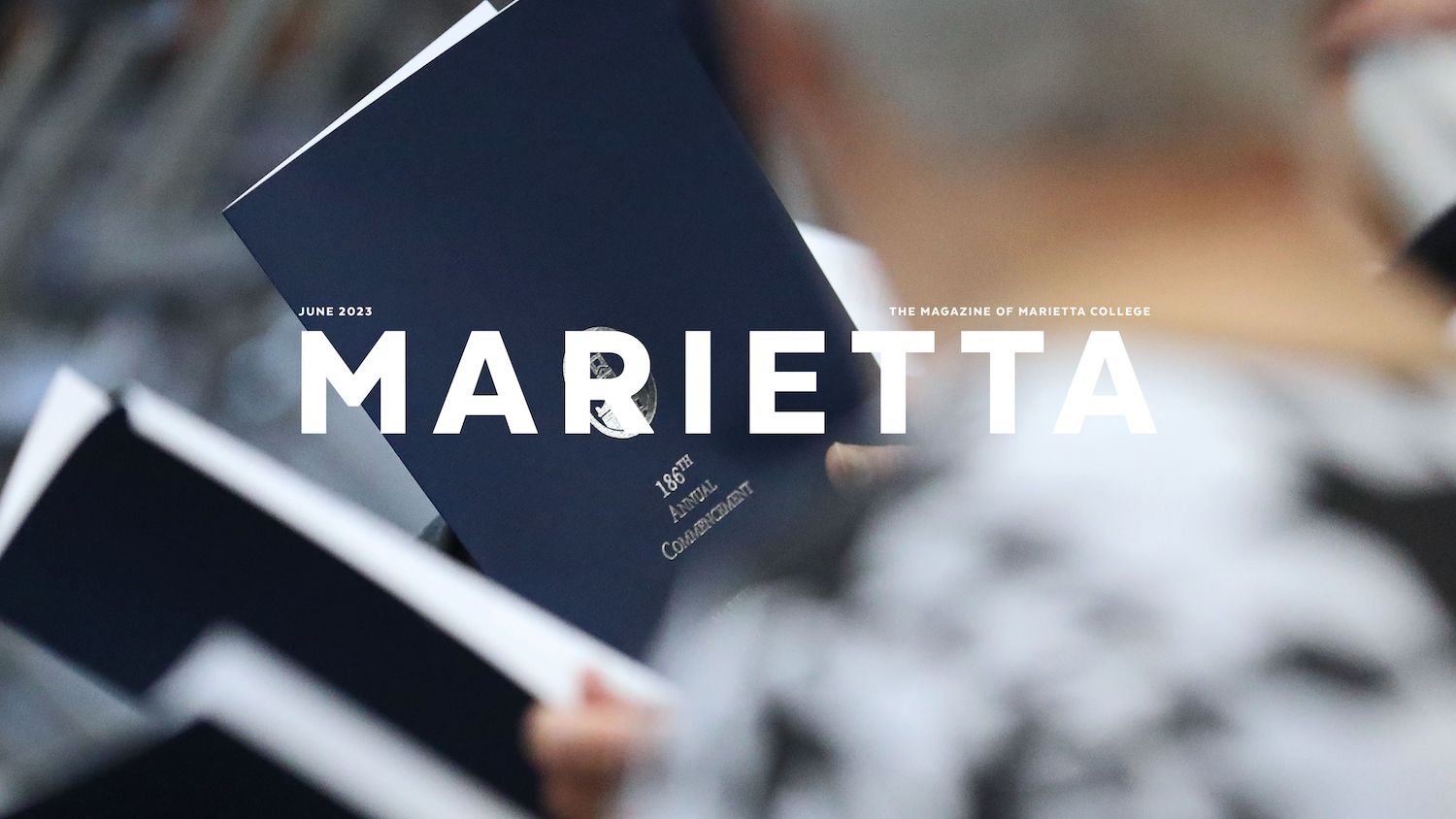
Media, Social Media and Publications
The Office of Marketing & Communication plays an integral role in writing, developing, and producing magazines, podcasts, Social Media and other publications that help in the marketing and publicity of the College.
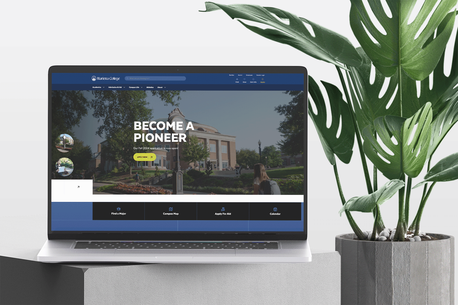
Web Services
The Office of Marketing & Communication oversees Marietta College's online web presence, including the maintenance and creation of the core website. This includes providing web services to Administrative and Academic Departments, and Student Clubs and Organizations.
Minor edits to copy, photos, documents, etc., are generally executed in the order they are received. Web Services can create an online form for you upon request. You must provide the text copy and the information to collect. Please contact Marketing@marietta.edu if you have a web service request.